Statement of intent
For my Weebly content I would like to produce a range of work from many different locations. The theme for my current project is portrait, in this I want to take photos in many different locations to help show emotion and feelings on my work such as loneliness, sadness, anger and much more. The way I intend to do this is by travelling through salford quays of to capture the feeling of loneliness. I would like to enhance them using Photoshop and edits to further create emotion and make the viewer feel a range of things. The edits I want to do are dispersion double exposure and color blobs.
Once I have a wide range of photos I want to try and link them to many other artists work. One of my personal favorite artists is Richard Avedon and my favorite set of photos by him is his photos documenting the final years of his father life as you can see the many begin to fade, Avedons use of editing to desaturate the photos further shows the sadness he and his father must have been feeling at the time. I also think the way Richard desaturates all of his photos and takes close ups of peoples faces is very eye catching and intriguing. The reason I have picked this photographers as one of the main photographers is because I really like that style of work.
To further add to my portfolio I want to develop my ability in photo-shop as I have messed around in it for a little bit before but was never really able to create something to be pruned of in the project I would like to create an array of photos that demonstrate the progress have made on photo-shop from just rotating and outlining photos to creating effects like dispersion and double exposure. but before I can't do complex edits I need to fully experiment with camera settings such as white balance and exposure to create the photos I really want. To finish off my project I want to do digital final gallery full of my best edits and photo's. the camera skills I need to develop are my angles and I don't often realise when I can use certain things like rule of thirds or symmetry
Analysis 1

Context
This image, was made in September 12th 2017 and this photo, was taken by Annie Leibovitz. Annie Leibovitz, was born in October 2 1949 in America in a house with 6 siblings and she had a passion towards art music and athletics. She is best known for her portraits of political figures, musicians, and athletes, regularly featured in magazines, fashion, and advertising. Additionally, Many of Leibovitz's portraits of rock music celebrities have become signature images. One, of his notable photos of was John Lennon on a bed fully clothed, with his wife. She had, been showcased in several books and art exhibition in USA and many other European countries.
Content
The photo consists of a young child looking sad/alone, their is a windy effect coming down onto her hair and face. The black backdrop makes the photo seem gloomy and sad and makes the girl seem more depressed. The photo is a portrait photo of a girl but is taken in a landscape angle. I can also see that the the backdrop area is edited and I think the shine on her cheeks and eyes have been edited furthermore the photograph is a portrait and it represents fear and loneliness. The picture is realistic and also isn't as the content of the photo is realistic but as it it edited so much I would so say that its not realistic. The message of the picture is almost sad and depressing as the girl looks lost and unhappy The way she looks into the camera lens with the bright blue shiny eyes the more is conveys the feeling that she is lost. I do think that The sadness In her face has been exaggerated for the sake of the picture so it look's very slightly unrealistic. The rough theme of the work is sadness and shame. The work communicates an emotion of sadness and depression. The texture in the photo adds a deeper meaning and shows more detail of the emotion the rough course texture of the photo and the shiny cheeks of the girl and bright face makes the photo look old the reason for texture being used is to add visual interest highlight unique patterns and show evoke emotion. texture also overlaps with many kinds of photography from classic portraiture to fine art. The reason lighting is used is it determines the brightness and darkness but also the mood, atmosphere and tone.
Composition
Their is a foreground and a middle ground the girl is in the foreground and some of her hair and the middle ground. A tripod was most likely used for this photo as their is no camera shake and the camera is very in focus and still. The way the photo was taken I think it was in a studio with a backdrop and lighting and if I had taken the photo I would have used f/2.0 for my f-stop this is because then my photo won't be overexposed and to white or under exposed and to dark. My white balance would have been tungsten, fluorescent or flash this is to avoid the photo being to dark/light but most likely for this photo flash as use. With 600 ISO because then the image wont be grainy. The photo has also got rule of thirds this leaves empty space to the left of the subject in the photo to draw more attention to certain portions f the image. Their is also very very strong leading lines in the photo on the girls hair as the wavy hair attracts people's eyes down the strands of hair and from one side of the photo the the other side of the photo. The lighting in this photo shines onto the for sides of the models face it is very bright on the left and fades away on the right. Their is also contrast between the sides of the photo as one side where the face is and then the opposite side of the image there is no light. The dark backdrop creates an effect of surrealism this is because it is very abstract. The reason we use compositional rules is to enrich images and make then more visually appealing it adds a level of depth to the images.
Connection
I like the work piece respect by Annie Leibovitz as I love the was she takes her photo and the composition were she uses rule of thirds and the was she's edited the wind into the Child's face. In my opinion the most noticeable mistake is that their Is lots of empty space were their is nothing and in my opinion it doesn't look very good. The majority of Annie Leibovitz's photos have some kind of nature in them such as the wind an animal or the photo is taken outside this is a common theme in her pictures to contain nature and wildlife. The way I will use Annie Leibovitz's work in mine the next time I do a photo-shoot I will try to either recreate the wind affect she has shown of take my photos outside.
The skill needed to focus on are using nature and my surroundings in my photo
Analysis 2

Context
This photo was made in August 25th 1973 made in Florida and it is a photo of Richard Avdeon. father Jacob Israel Avedon. Born in New York City, Richard Avedon, was the son of son of Russian-Jewish parents, Jacob and Anna Avedon. His exposure to fashion and photography began at an early age. Since his father owned a women's specialty clothing store on Fifth Avenue, he was often present in the shop. Avedon's father was instrumental in cultivating his growing interest in photography particularly fashion photography.
Content
The photo is of Jacob Israel Avedon For the last six years of his father's life, Avedon documented the deterioration of his health and arguably his spirit in many photos. In this deeply unsettling image Avedon's father wears an expression of deep distress or anxiety. Stiff and uncomfortable in a somber black suit, Jacob is set against a Blank, white background into which his head seems to sink in. The photo captures the uncertainty and fear both father and son must have been experiencing. He began taking portraits of his father, Jacob Israel Avedon, when he visited him at the home where he had relocated in Sarasota, Florida. A few years after Avedon began the series, Jacob was diagnosed with cancer, to which he finally passed in 1973. The work was not specifically made for anyone it was made to document Jacobs last 6 years of his life. The photo is portrait, the work represents the slow but steady deterioration of Jacob Avedon The name of the photo is Jacob Israel Avedon, Sarasota, Florida, August 25th 1973 The title makes us realize that the photo was not taken for any specific reason or for traction by the media is was just made to document the final days of Jacobs life. Even though the photo is edited it is realistic. The work communicates a message of sadness and anxiety as you can see in Jacobs face that he knows his fathers time is nearly up. A theme with sad photos is that they often don't have much lighting this can show many things such as peoples ideas being muted and much more than just muting but almost every photo that is desaturated had been made like that for a reason normally to show feeling. Their is also a lot of negative space around the man as his body and head is the only thing that you can really see as their isn't much else to the photo.
Composition
Central focal point is used . As soon as you glance/look at the photo you instantly lock eyes with Jacob Avedon and you can see the pain in his eyes as he is dying this gives the overall mood of the photo a sad theme and a dark gloomy look. There is also a line of symmetry running down his nose but there are some areas of his face where there is no symmetry as his face is almost warped this show's that his age has caught up to him . There are very strong leading lines going around the shirt in the areas where the picture goes from white to black and black to white this makes your eyes follow the lines across the photo. It is also a close up photo of his face that added more emotion to the photo. There are clear textures on his face especially the wrinkles of his cheeks, the texture also adds a sense of depth to the photo and how the foreground were his eyes are is in focus but in the background his ears are not.
Connection
I like Richard Avedon's work as is often shows emotions much better than any other photographer a strength to their work is that they appeal to a younger audience as they have an old style look to them. a weakness is that most if not all of his photos if not all f his photos have been desaturated or a gradient map has been used to take the color out of the photo (this has been done to almost all of his photos.) His work links t mine in the fact i want to try capture emotion and I also desaturate my images. In future shots i will try to capture emotion and get close up shots of peoples faces and not their whole body. I need to focus on my camera settings skills and the best settings to use in certain surroundings and environments I also need to practice framing and the best way to compose a photo.
Analysis 3
Content
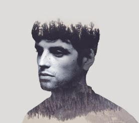
In the photo you can see a man gazing off into the distance. It is a portrait photo but it is also slightly abstract as it is a double exposure edit. The work could represent a few things such as the feeling that he might be experiencing In his life at the moment.I'm not sure what the photographer called the work. The stock photo is realistic and even the edited photo does not contain many surreal themes . The eyes seem to have been distorted to me as they have had large shadows cast over them to further exaggerate the feeling this man might be Having in the moment of the picture. This then further conveys his feeling which I believe to have been a mixture of things such as sadness and loneliness or even sorrow to the viewer . The theme of this work might be to do with nature or double exposure as the edit that is put on the man is a edit of trees and a forest the edit fits very well with the photo as the man looks lonely and or sad and a forest or woods can be considered lonely and sad at times. The message that is communicated could be to do with mental health and people who are struggling in life as the man looks very lost and alone in his head. The man doesn't seem to have much facial expression nor does his body specifically have a pose; he's just stood there gazing off into the distance longingly. The only shape I can recognize is an almost hourglass shape going from the base of the man to the top of his head. This could symbolize that the man is dying and the hourglass symbolizes his time physically running out. The positive space is the man's face and body and the negative space is the empty areas like the gaps in between the trees and the blank space behind the man. Their is a dark tone used through this image but their is also a lighter tones used this shows the contrast between the two. Their is lots of different textures in this image as it changes a lot like the trees on the head and neck and then the clear face the contrast shows mood and feeling. Their is not many shapes in the image as their is just a human face although facial expression of the person in the image is this look of despair he looks lost like he's missing something in life.
Composition
There are strong leading lines along the shoulder blades as the photo turns into the edit. There are also very strong leading lines along the outline of the face that makes us follow the picture in a way the photographer wants us to follow the photo. The man's face is in the foreground, his hair that has become trees is in the middle ground, and the start of his torso is in the background. The photographer has most likely used a tripod for the photo. As the photo has been desaturated, edited and manipulated I'm not fully sure what the camera settings would have been but most likely the ISO was around 200 the shutter speed was probably very quick as the photo was most likely taken in a studio. With the correct lighting and environment. Now as your eyes move off the man's face you are met by a very blank grey background that just looks like it took the will to live out of the man. There are 2 images to discuss here, the portrait and the landscape. The photo may have been taken taken in a studio using a tripod and a backdrop with the correct lighting. This photo is one of the photos that just has a sad/eerie look to it the whole at atmosphere of the photo is a bit eerie and gloomy. on top of being a naturally sad photo the edit done to the man of the double exposure clearly shows and demonstrates what the photo is representing. The same as a lot of photos their is lots of negative space this enhances the sense of isolation from the subject and the background.
connection
I personally like this photo as I think it does an amazing job at showing the emotion of the man as he stares blankly into the distance. The emotionless face coupled with the sad depressing overall look of the photo creates a lonesome impression on the viewer. The only weakness I have seen in this photo/this edit is that in my personal opinion in the photo of the man the opacity should be turned up a little bit more. I also think that the ear should have been made part of the edit more. It should definitely still resemble an ear but I think if the edit on the ear was a bit faint the face would blend with the edit much better. This photo specifically depicts a man gazing off into the distance. The picture and edit was clearly taken/done to show emotion and feeling as there is lots of information you can infer from the edit even without the title or a context. You can easily think of what might be going on in the man's head. The way this artist's work links to mine is the fact that I do double exposure and I also try to show my models feelings and emotion in my photos/edits by manipulating the light and changing the theme of the picture. The skills I need to focus on are mainly my editing skills and I need to take photos that are in higher resolution and more focused. Sometimes I have camera shake and sometimes my photos are slightly blurry and I don't notice that they are as I just assume that my camera settings are fine. So I need to focus on keeping my camera steady and/or using a tripod. While looking at my photos every so often to see if they're in focus, blurred, dark and grainy or if the background is blurred while the foreground isn't or vice versa.


This is my best photo from this shoot as everything in the photo went well I used cloudy white balance the reason i used this is because almost any other white balance would have made my photo blue and stained. an ISO of about 200 this made sure my photo wasn't to dark or grainy. shutter speed about 1/1000 to avoid to photo from being blurry. I used central focal point and worms eye view I this picture.
This is my worst photo from this shoot as Ashok was was not looking at the camera also the angle was not good as the backdrop is not in view and you can see are drama studio/room. My f stop was about f/6 this let made the background slightly blurry. white balance was cloudy to avoid a Blue tint in the photo. My f-stop was at 1/1000 this made sure the main focal point of the image was not blurred.


Shoot 1


This is 100% my best photo so far as the lighting on Theos face was amazing and the leading lines with his hair was good. My f stop was around f/22 this kept my central focal point witch was Theo in focus and the background was in focus. My white balance was at daylight to make sure my image wouldn't turn out blue tinted my shutter speed did not really matter for this photo as their was nothing moving except maybe camera shake but my shutter speed was at about 1/1000

This is one of my worst photos even though the wind helps create leading lines. The reason this I one of my worst photos is because my ISO was incorrect and it made the photo look grainy and bad. The photo also is not in focus.the f stop was also way to low as is made Theos hair look blurred

This is one of my best and favorite photo's s the lighting and shadows are very nice I used a white balance of daylight to make sure the photo was not over exposed my f-stop was at about f/4.0 is should have been a bit lower to avoid a blurry background. My shutter speed was at 1/1000 to make sure that my photo was not motion blurry.
Shoot 2
first pictures no props


with this photo my white balance was way to low and not much light was captured and the photo went black

This is my best photo even though the lighting and the white balance was wrong the white balance being wrong resulted in the photo being blue but even though the camera was not in focus it looked very good a the end.
second set of pictures with base guitar


The reason this is my best photo is because it has a little bit of rules of thirds as Theos head and the neck of the guitar are in good locations because of the angle i took the photo from was a bit boring he luckily faced in an awkward way this made the photo have a bit more texture to it this was unplanned white balance was on shady my ISO was on auto but I'm going to guess it was around 200 this means their isn't to much light coming through with could of lead to the photo being over exposed the shutter speed wouldn't likely be high as the subject wasn't moving it was probably around 2 or 4


The camera setting that I used for this photo were as follows, my f stop was at f/8 to make sure that not to much light gets let into the camera lens and didn't over expose the photo. I used cloudy white balance as something like daylight would make the photo blue. My shutter speed is 1/500. The ISO was about 200 this stopped my photo from being grainy/blurry. A combination of all these settings made the photo look slightly blurred as Theo looked down his hand to the camera in this photo we used central focal point and we took the photo from a worms eye perspective.
Plan for Shoots
Name: Lukas Bird
Project Title/ shoot number: portrait/media city shoot
Description of aims for shoot:
In this shoot i aim to photograph my model and try to get some pictures of the canal in the background and some of the old buildings in my shot and to take candid photos.
Links with Photographers
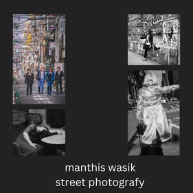
I will link back to Jill Freedman's street photography as i rarely like many of her photos were many of the people look completely oblivious to her taking the photo or were the people in the photo don’t look like their actually posing.
Location: My shoot location will be media city Manchester
The only kit the I may need is a tripod otherwise I will not need any kit apart from my camera itself I will need a spare coat for different moods of my photo and an umbrella, sunglasses .
Props/ items needed: I will need a spare coat for different moods of my photo and an umbrella, sunglasses
Kit needed e.g. lighting, tripod, backdrop, macro lens: The only kit the I may need is a tripod otherwise I will not need and kit apart from my camera itself
F-Stop : I will want the focal point to be the object and the backdrop slightly in focus. So i will use f-stop f/22-f/16
White Balance: I will use daylight white balance when I am shooting my photos in the sun but when I am in the shade I will use cloudy.
Shutter speed: I will use a very high shutter speed as I am outside. I don't want the wind to blur anything like leaves.
ISO: I will keep my ISO at about 200 as i don't want my picture to come out dark and grainy
Which compositional rules will I use? The compositional rules I will use is rule of thirds when I can, I will also use leading lines possibly with my models coat or bag. I will use symmetry and triangles with some objects such as bags, hats, coats. I will also definitely take photos from a worm's eye view and a bird's eye view position. I will also Use central focus point lots.
Name: Lukas Bird
Project Title/ shoot number: portrait/media city shoot
Description of aims for shoot:
In this shoot i aim to photograph my model and try to get some pictures of the canal in the background and some of the old buildings in my shot and to take candid photos.
Links with Photographers
I will link back to Jill Freedman's street photography as i rarely like many of her photos were many of the people look completely oblivious to her taking the photo or were the people in the photo don’t look like their actually posing.
Location: My shoot location will be media city Manchester
The only kit the I may need is a tripod otherwise I will not need any kit apart from my camera itself I will need a spare coat for different moods of my photo and an umbrella, sunglasses .
Props/ items needed: I will need a spare coat for different moods of my photo and an umbrella, sunglasses
Kit needed e.g. lighting, tripod, backdrop, macro lens: The only kit the I may need is a tripod otherwise I will not need and kit apart from my camera itself
F-Stop : I will want the focal point to be the object and the backdrop slightly in focus. So i will use f-stop f/22-f/16
White Balance: I will use daylight white balance when I am shooting my photos in the sun but when I am in the shade I will use cloudy.
Shutter speed: I will use a very high shutter speed as I am outside. I don't want the wind to blur anything like leaves.
ISO: I will keep my ISO at about 200 as i don't want my picture to come out dark and grainy
Which compositional rules will I use? The compositional rules I will use is rule of thirds when I can, I will also use leading lines possibly with my models coat or bag. I will use symmetry and triangles with some objects such as bags, hats, coats. I will also definitely take photos from a worm's eye view and a bird's eye view position. I will also Use central focus point lots.
Theo tank


Finn


Viktoria at the imperial war museum


Viktoria at media city bridge


Viktoria near coronation street


ashok


finn best

This is one of my best photos From the Trip as the light was captured just right and The photo turned out amazingly the settings I used for this photo was a High f-stop of about 22 to keep the background in focus as well as Finn, I had my white balance set to daylight to avoid my photo being over exposed or under exposed, my ISO was at 200 to stop my photo from being grainy and dark, my shutter speed was quite high as I needed to make sure my photo was not under exposed with to high of an shutter speed but was not over exposed to the daylight at a low shutter speed. A combination of all of these settings made my photo come out very well. The way I framed this photo was using the rule of thirds and central focus point. There are also leading lines going down his leg; this wasn't intentional. Finally when I took this photo I took it from a birds eye view perspective to get a better angle on Finn. This gave the overall mood of the photo. If I were to take this photo again I would take it when there is no sun or little sun as I think the photo is slightly overexposed and it would look better with more of a shadow from Finn.
Viktoria best

This is one of my best photos From the Trip as the light was captured just right and The photo turned out amazingly the settings I used for this photo was a low f_stop the background was slightly out go focus. I had my white balance set to daylight to avoid my photo being over exposed or under exposed, my ISO was at 200 to stop my photo from being grainy and or dark, my shutter speed was high as I needed to make sure my photo was not under exposed with a high shutter speed but was not over exposed to the daylight at a low shutter speed. A collection of all of these settings and and the way I framed the picture made my photo come out very well. The way I framed this photo was with using central focus point there is also . Finally when I took this photo I took it from a worms eye view perspective to get a better angle on Victoria.
Ashok worst

The reason this is one of my worst photos is because the photo was overexposed due to my white balance being wrong I think is was set to shady my ISO was at about 400 as the photo did come pout a little bit more grainy than I wanted my f-top was at about 4 as the photo was to over exposed to the light I also had some motion blur and camera shake in the picture Ashock also was looking up at the sky not at the camera the framing for this photo was a worms eye view perspective and central focal point.
Finn worst

This is another one of my worst photos. The photo was under exposed due to my white balance being wrong. It was set to shady. I should have had it in the sun. My ISO was at 200 to make sure my photo wasn't too dark and grainy. My f-stop was at about 22. When taking this photo I couldn't get a shot where the camera wasn't over exposed. There is also some camera shake as I couldn't hold the camera still due to the wing and how cold the weather was. The framing i used for this photo was central focal point I tired to use rule of thirds with his hands but his position prevented me I also used leading lines going down the sides of his hoodie as i knew the sun would be shining at the right angle for him to have a slight glow on his right side. If I cold take this photo again I would try to take it from a different angle where the sun is right behind Finn and I would put it so the lese stays open for 10 seconds I think this as a long exposure photo would work really well the suns rays will be coming from around the sides of Finn. I would also use a tripod to avoid camera shake and motion blur.
Power of you day


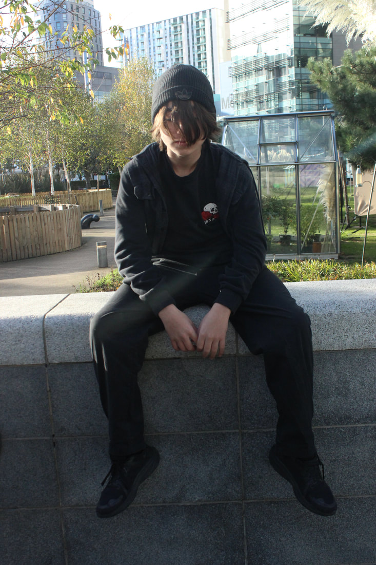
Here are a few snippets of my first edit on Finn
This is the video I used to help me https://youtu.be/iy-9P99fNCc
https://www.youtube.com/watch?v=eSi4YU8wdl4
This is the video I used to help me https://youtu.be/iy-9P99fNCc
https://www.youtube.com/watch?v=eSi4YU8wdl4


|
|


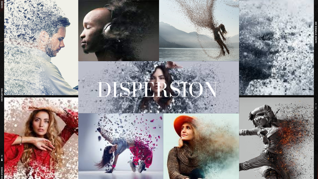
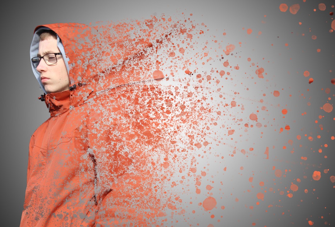
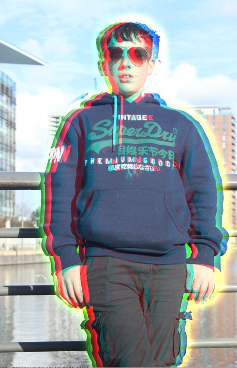
Dispersion Edits

|

|


|


|


https://www.youtube.com/watch?v=QsJpDFQA4TA this is the video I used for all of my dispersion edits
Double exposure Edits
|
|

|

|
|
|

|

|


|

|

|


Final gallery
Dispersion edits


dispersion combo edits


|

|
Evaluation
I did not really explore many different themes with this project but I did with my editing as it was my first time editing I took the opportunity to try new and different things the this meant I could develop my ideas into any kind of image I wanted. I had a lot of freedom with his project so I could experiment with edits and photos. The main person I researched for this project was john Avon I really like the series he did of his father in the years running up to his death and I think his photos capture a lot of emotion and feeling The most common theme I have addressed is leading lines worms eye view and birds eye view.
I think one of the most challenging things about this project was having to work in the style of other photographers this meant I had to constantly be taking photos how they take them. This meant I couldn't just take a photo and it was fine I had to think about my placement more and my angles. I think my final outcomes for this project came out well In this project the edits I focused on was dispersion and I think my dispersion edits came out really well. I think I successfully developed my themes in this project. If I had more time I would have liked to try capturing emotion more and seeing how the way people look and stand can change the mood of a photo. My work is personal too me as lots of edits I have don't are kind of edits I have just made up from my skills with Photoshop so I feel like in my work their is a real sense of originality. I hope when viewers read/.look at my work they are inspired by it to go and do what they enjoy my work doesn't have any meaning its just what I have enjoyed their is no emotion or message being it it is just what I enjoyed so I did it.
